PRIME RESIDENCE

About Project
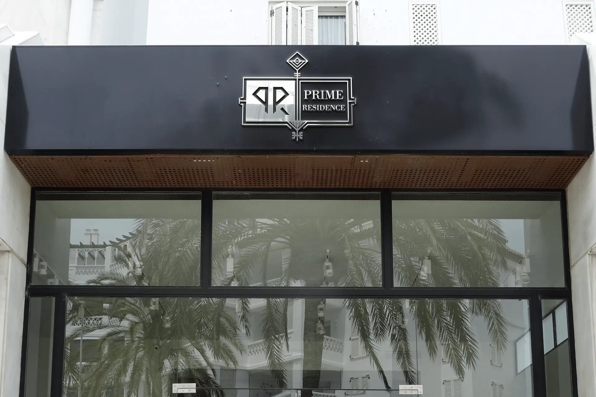
The logo of PRIME Residence represents the company commitment to unlocking the potential of every home and transforming it into a dream residence for its clients.
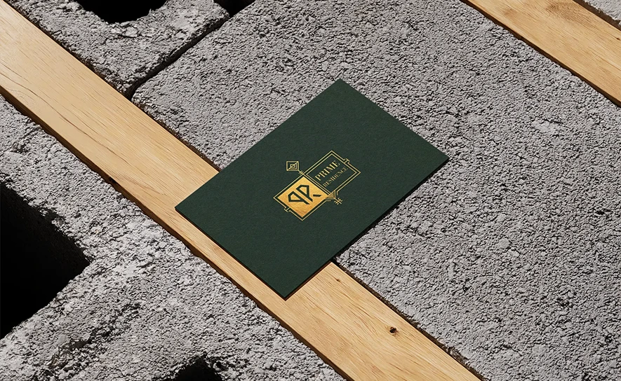
The visual hierarchy of the PRIME RESIDENCE logo is designed to convey sophistication and clarity. The key shape, prominently placed at the center, immediately draws attention and reinforces the company mission. The dark green and gold color scheme creates a striking contrast, enhancing the logo visual appeal and making it easily recognizable. The typography is carefully chosen to complement the sleek design, with a refined and elegant font that emphasizes the company professionalism and commitment to excellence.
The Key Shape: The key at the center of the logo symbolizes unlocking the potential of a home, representing the company goal of creating dream residences for its clients. It is a powerful visual metaphor for transformation and new beginnings.
Dark Green Color: The dark green in the logo signifies growth, stability, and balance. It reflects PRIME RESIDENCE commitment to building homes that are not only beautiful but also durable and sustainable.
Gold Color: The gold represents wealth, success, and prestige. It conveys the company dedication to delivering high-end, luxurious homes that stand out in terms of quality and elegance.
Publish Date
January 03 - June 03, 2024
Client
PRIME RESIDENCE
Project Type
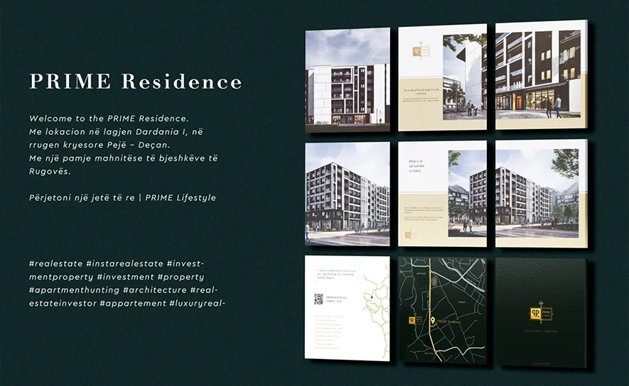
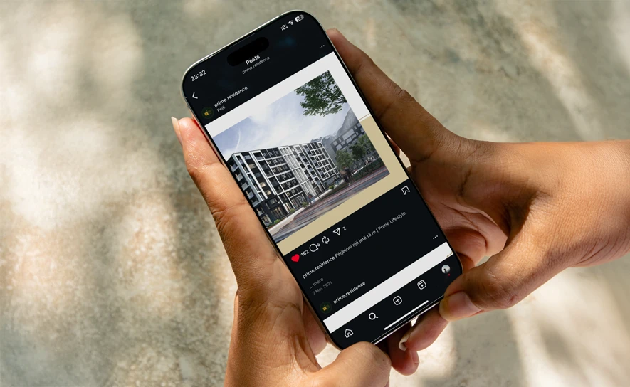
Branding & Social media management
Duration
2 Weeks
5 Months
5 Months

